
Visualizing feature importances is a key step in understanding how your XGBClassifier model makes predictions. The plot_importance() function provides a convenient way to directly plot feature importances from a trained model.
In this example, we’ll demonstrate how to use plot_importance() to visualize feature importances while including the actual feature names from the dataset on the plot, providing a clear and informative view of the model’s decision-making process.
from sklearn.datasets import make_classification
from sklearn.model_selection import train_test_split
from xgboost import XGBClassifier, plot_importance
import matplotlib.pyplot as plt

# Generate synthetic data
X, y = make_classification(n_samples=1000, n_features=10, n_informative=5, n_redundant=5, random_state=42)
feature_names = [f'feature_{i}' for i in range(X.shape[1])]

# Train/test split
X_train, X_test, y_train, y_test = train_test_split(X, y, test_size=0.2, random_state=42)

# Fit XGBClassifier
model = XGBClassifier(n_estimators=100, random_state=42)
model.fit(X_train, y_train)

# Set the feature names
model.get_booster().feature_names = feature_names

# Plot feature importances
plt.figure(figsize=(10, 6))
plot_importance(model.get_booster(), importance_type='weight')
plt.show()
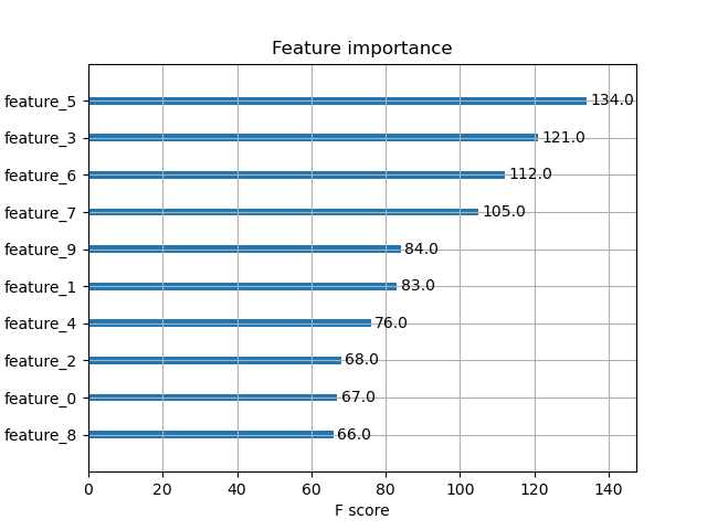
The plot may look as follows:
First, we generate a synthetic binary classification dataset using scikit-learn’s make_classification function. We set n_samples to 1000 and n_features to 10, with 5 informative and 5 redundant features. We also create a list of feature names, feature_names, to use when plotting.
Next, we split the data into training and testing sets using train_test_split, allocating 20% of the data for testing.
We then create an instance of XGBClassifier with 100 estimators and fit it on the training data.
Next, we set the feature_names property on the Booster model and then call the standalone plot_importance() function with our model and plot the feature importance with our feature names.
The resulting plot will display the feature importances as a bar graph, with the synthetic feature names on the x-axis, providing a clear visual representation of the relative importance of each feature in the XGBClassifier model’s decision-making process. The plot_importance() function automatically handles the plotting details, making it a convenient choice for quickly visualizing feature importances.