
Understanding feature importance is crucial when working with XGBoost models.
It helps identify which features have the most significant impact on the model’s predictions.
XGBoost provides a built-in function called plot_importance() that allows you to easily visualize feature importance.
In this example, we’ll demonstrate how to use plot_importance() with a real-world dataset.
from sklearn.datasets import load_breast_cancer
from sklearn.model_selection import train_test_split
import xgboost as xgb
import matplotlib.pyplot as plt

# Load the Breast Cancer Wisconsin dataset
data = load_breast_cancer()
X, y = data.data, data.target

# Split the data into train and test sets
X_train, X_test, y_train, y_test = train_test_split(X, y, test_size=0.2, random_state=42)

# Create DMatrix objects
dtrain = xgb.DMatrix(X_train, label=y_train)
dtest = xgb.DMatrix(X_test, label=y_test)

# Set XGBoost parameters
params = {
    'objective': 'binary:logistic',
    'max_depth': 3,
    'learning_rate': 0.1,
    'subsample': 0.8,
    'colsample_bytree': 0.8,
}

# Train the XGBoost model
model = xgb.train(params, dtrain, num_boost_round=100, evals=[(dtest, 'test')])

# Plot feature importance
xgb.plot_importance(model)
plt.show()
The plot may look as follows:
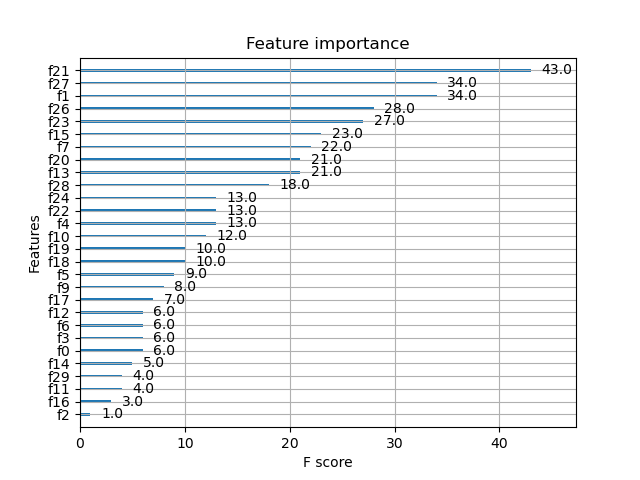
In this example, we first load the Breast Cancer Wisconsin dataset using scikit-learn’s load_breast_cancer() function. We then split the data into train and test sets and create DMatrix objects for XGBoost.
Next, we set the XGBoost parameters and train the model using xgb.train(). After training, we use the plot_importance() function to visualize the feature importance. By default, plot_importance() plots the features in descending order of importance.
You can customize the plot by passing additional arguments to plot_importance(). For example, you can change the plot type to a bar chart by setting importance_type='total_gain' and max_num_features to display only the top N features:
xgb.plot_importance(model, importance_type='total_gain', max_num_features=10)
plt.show()
The resulting plot will display the top 10 features based on their total gain, which represents the average gain of splits that use the feature.
By visualizing feature importance using plot_importance(), you can gain valuable insights into which features have the most significant impact on your model’s predictions. This information can help guide feature selection, model interpretation, and domain-specific understanding of the problem at hand.