
When interpreting machine learning models, it’s often useful to focus on the most important features rather than the full set. This can help simplify the interpretation process and highlight the key drivers of the model’s predictions.
In this example, we’ll show how to plot the top N most important features from an XGBoost model, where N is controlled by a variable. This allows for flexibility in the number of features displayed, making it easy to adjust the plot based on the specific needs of the analysis.
We’ll use a synthetic dataset with a known set of features for this example. The dataset will be generated using scikit-learn’s make_classification() function, which creates a random classification problem with specified parameters.
from sklearn.datasets import make_classification
import xgboost as xgb
import matplotlib.pyplot as plt

# Generate a synthetic dataset
X, y = make_classification(n_samples=1000, n_features=20, n_informative=10,
                           n_redundant=5, n_repeated=0, n_classes=2,
                           random_state=42)

# Create feature names
feature_names = [f'feature_{i}' for i in range(X.shape[1])]

# Create DMatrix object
dtrain = xgb.DMatrix(X, label=y, feature_names=feature_names)

# Set XGBoost parameters
params = {
    'objective': 'binary:logistic',
    'max_depth': 3,
    'learning_rate': 0.1,
    'subsample': 0.8,
    'colsample_bytree': 0.8,
}

# Train the XGBoost model
model = xgb.train(params, dtrain, num_boost_round=100)

# Set the number of top features to plot
top_n = 10

# Plot feature importance with feature names
fig, ax = plt.subplots(figsize=(10, 6))
xgb.plot_importance(model, ax=ax, importance_type='gain',
                    max_num_features=top_n, show_values=False)
plt.yticks(range(top_n), model.feature_names[:top_n])
plt.xlabel('Gain')
plt.title(f'Top {top_n} Most Important Features')
plt.show()
The plot may look like the following:
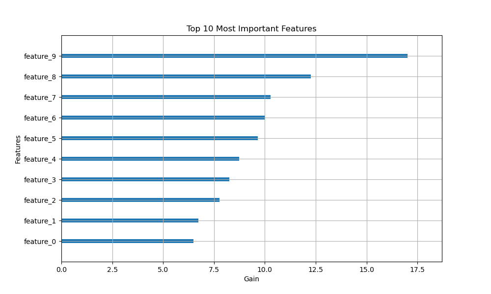
In this example, we first generate a synthetic dataset using make_classification() with 1000 samples, 20 features (10 informative, 5 redundant), and 2 classes. We then create feature names for each of the 20 features in the format ‘feature_0’, ‘feature_1’, etc.
Next, we create a DMatrix object for XGBoost, passing the feature names to the feature_names parameter. We set the XGBoost parameters for a binary classification problem and train the model using xgb.train().
To plot the top N most important features, we define a variable top_n and set it to 10. We then use plot_importance() with max_num_features=top_n to limit the plot to the top 10 features. The importance_type is set to ‘gain’ to rank features by their total gain contribution.
To include the feature names on the y-axis, we use plt.yticks() and pass the top N feature names from model.feature_names.
Finally, we set the x-label and title of the plot, specifying the number of top features being displayed.
The resulting plot will show the top 10 most important features ranked by their gain, with the feature names clearly listed on the y-axis. By adjusting the top_n variable, you can easily change the number of top features displayed in the plot.
This approach provides a concise and informative way to visualize the most important features in an XGBoost model, focusing attention on the key drivers of the model’s predictions.