
When working with machine learning models, understanding the relative importance of input features is crucial for model interpretation and feature selection.
XGBoost provides a convenient way to visualize feature importance using the plot_importance() function. However, the default plot doesn’t include the actual feature names, which can make interpretation difficult, especially when working with datasets that have many features.
In this example, we’ll demonstrate how to plot feature importance from an XGBoost model while including the feature names on the plot.
We’ll use the well-known Iris dataset, which has four clear feature names: sepal length, sepal width, petal length, and petal width.
from sklearn.datasets import load_iris
import xgboost as xgb
import matplotlib.pyplot as plt

# Load the Iris dataset
iris = load_iris()
X, y = iris.data, iris.target

# Create DMatrix objects
dtrain = xgb.DMatrix(X, label=y, feature_names=iris.feature_names)

# Set XGBoost parameters
params = {
    'objective': 'multi:softprob',
    'num_class': 3,
    'max_depth': 3,
    'learning_rate': 0.1,
    'subsample': 0.8,
    'colsample_bytree': 0.8,
}

# Train the XGBoost model
model = xgb.train(params, dtrain, num_boost_round=100)

# Plot feature importance with feature names
fig, ax = plt.subplots(figsize=(10, 6))
xgb.plot_importance(model, ax=ax, importance_type='total_gain',
                    max_num_features=len(iris.feature_names),
                    grid=False, show_values=False)
plt.xlabel('Total Gain')
plt.title('Feature Importance')
plt.show()
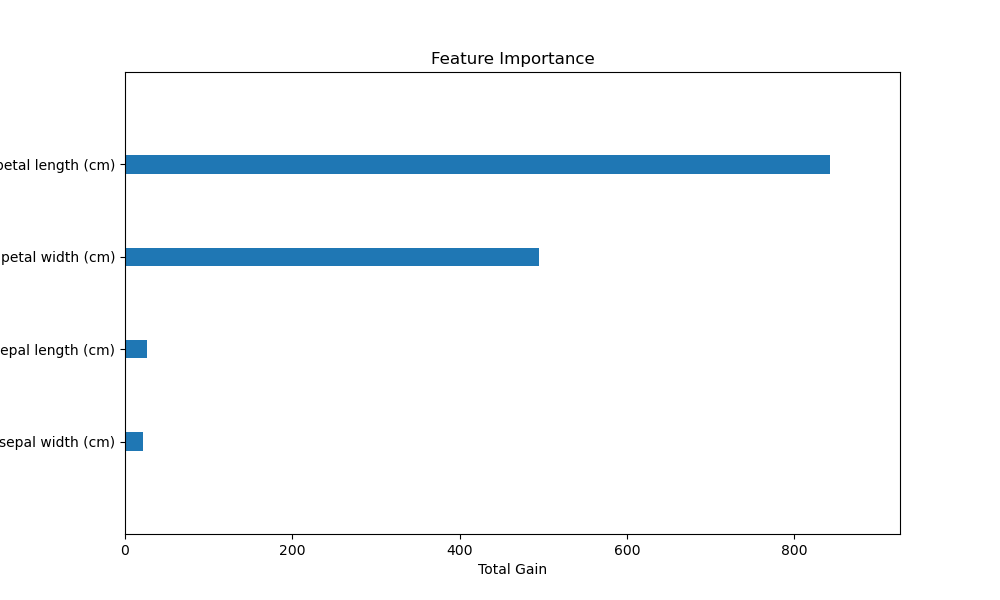
The plot may look as follows:
In this example, we first load the Iris dataset using scikit-learn’s load_iris() function. We then create a DMatrix object for XGBoost, passing the feature names from iris.feature_names to the feature_names parameter.
Next, we set the XGBoost parameters for a multi-class classification problem and train the model using xgb.train(). After training, we use the plot_importance() function to visualize the feature importance.
To include the feature names on the plot, we pass the trained model to plot_importance() along with some additional arguments:
ax=ax: Specifies the matplotlib axis to draw the plot on.importance_type='total_gain': Sets the importance metric to total gain.max_num_features=len(iris.feature_names): Limits the number of features to display based on the number of feature names.grid=False: Removes the grid from the plot for a cleaner look.show_values=False: Hides the numerical values of the importance scores.
Finally, we set the x-label and title of the plot using plt.xlabel() and plt.title(), respectively.
The resulting plot will display the feature importance as a horizontal bar chart, with the feature names on the y-axis and the total gain on the x-axis. This makes it easy to interpret which features are most important for the XGBoost model when trained on the Iris dataset.
By including feature names when plotting feature importance, you can enhance the interpretability of your XGBoost models and facilitate better communication of your findings to stakeholders.