
Extracting and visualizing feature importances is a crucial step in understanding how your XGBClassifier model makes predictions.
In this example, we’ll demonstrate how to plot the feature importances while including the actual feature names from the dataset on the plot, providing a clear and informative view of the model’s decision-making process.
from sklearn.datasets import make_classification
from sklearn.model_selection import train_test_split
from xgboost import XGBClassifier
import matplotlib.pyplot as plt

# Generate synthetic data
X, y = make_classification(n_samples=1000, n_features=10, n_informative=5, n_redundant=5, random_state=42)
feature_names = [f'feature_{i}' for i in range(X.shape[1])]

# Train/test split
X_train, X_test, y_train, y_test = train_test_split(X, y, test_size=0.2, random_state=42)

# Fit XGBClassifier
model = XGBClassifier(n_estimators=100, random_state=42)
model.fit(X_train, y_train)

# Extract feature importances
importances = model.feature_importances_

# Plot feature importances
plt.figure(figsize=(10, 6))
plt.bar(range(len(importances)), importances)
plt.xticks(range(len(importances)), feature_names, rotation=45)
plt.xlabel("Features")
plt.ylabel("Importance")
plt.title("XGBClassifier Feature Importances")
plt.show()
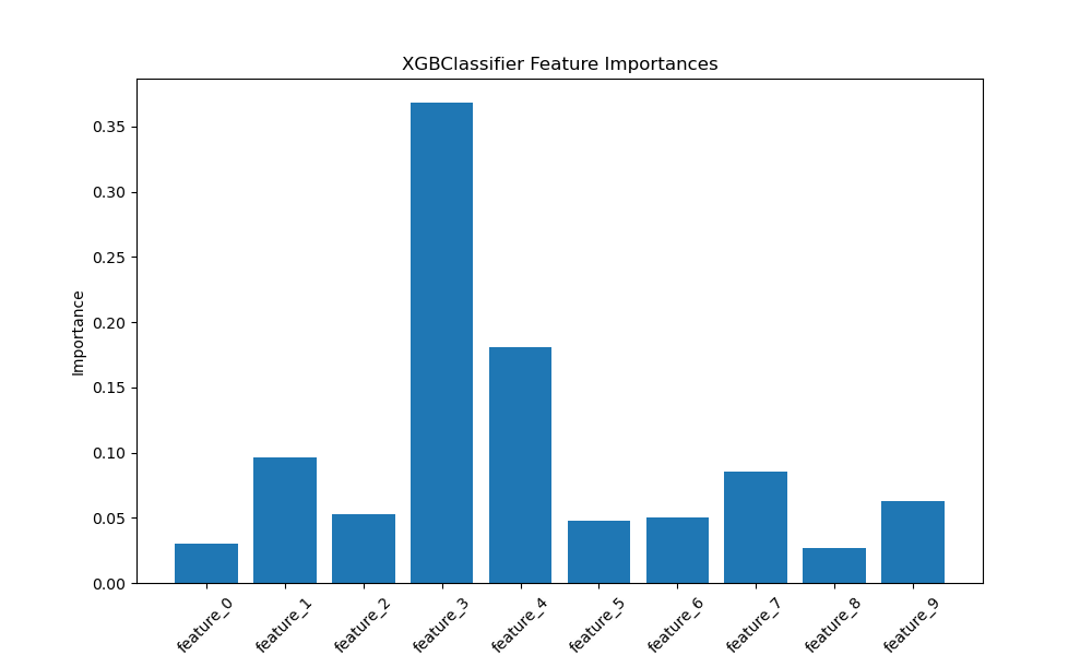
The plot may look like the following:
First, we generate a synthetic binary classification dataset using scikit-learn’s make_classification function. We set n_samples to 1000 and n_features to 10, with 5 informative and 5 redundant features. We also create a list of feature names, feature_names, to use later when plotting.
Next, we split the data into training and testing sets using train_test_split, allocating 20% of the data for testing.
We then create an instance of XGBClassifier with 100 estimators and fit it on the training data. After training, we extract the feature importances from the fitted model using the feature_importances_ attribute.
Finally, we create a bar plot of the feature importances using Matplotlib. We set the figure size to (10, 6) for better readability. We use plt.bar() to plot the importances, with range(len(importances)) as the x-coordinates and importances as the heights.
To display the feature names on the x-axis, we use plt.xticks(), passing range(len(importances)) as the tick locations and feature_names as the tick labels. We rotate the x-axis labels by 45 degrees for better visibility.
We add labels for the x-axis and y-axis using plt.xlabel() and plt.ylabel(), respectively, and set the plot title with plt.title(). Finally, we display the plot using plt.show().
The resulting plot will display the feature importances as a bar graph, with the synthetic feature names on the x-axis, providing a clear visual representation of the relative importance of each feature in the XGBClassifier model’s decision-making process.