
Visualizing the performance of your XGBoost time series model is crucial for understanding how well it captures the underlying patterns and trends in your data. In this example, we’ll demonstrate how to plot the actual and predicted time steps for a time series dataset, allowing you to assess your model’s predictive accuracy at a glance.
import numpy as np
from xgboost import XGBRegressor
import matplotlib.pyplot as plt

# Generate a synthetic time series dataset
def generate_time_series_data(n_steps, n_features):
    X = np.random.rand(n_steps, n_features)
    y = np.sin(X[:, 0]) + 0.1 * np.random.randn(n_steps)
    return X, y

# Set the number of time steps and features
n_steps = 1000
n_features = 5

# Generate the dataset
X, y = generate_time_series_data(n_steps, n_features)

# Split the data into training and testing sets
train_size = int(0.8 * n_steps)
X_train, y_train = X[:train_size], y[:train_size]
X_test, y_test = X[train_size:], y[train_size:]

# Create and train the XGBoost model
model = XGBRegressor(n_estimators=100, learning_rate=0.1, random_state=42)
model.fit(X_train, y_train)

# Make predictions on the test set
y_pred = model.predict(X_test)

# Plot actual vs. predicted time steps
plt.figure(figsize=(10, 6))
plt.plot(range(len(y_test)), y_test, label='Actual')
plt.plot(range(len(y_pred)), y_pred, linestyle='--', label='Predicted')
plt.xlabel('Time Steps')
plt.ylabel('Value')
plt.title('Actual vs. Predicted Time Steps')
plt.legend()
plt.show()
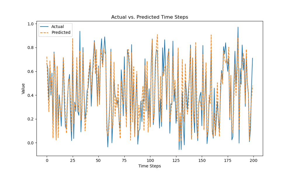
The plot may look as follows:
To begin, we generate a synthetic time series dataset using a combination of a sine function and random noise. The dataset consists of 1000 time steps, each with 5 features. We then split the data into training and testing sets, using 80% for training and the remaining 20% for testing.
Next, we create an XGBRegressor model and train it on the training data using 100 estimators and a learning rate of 0.1. After training, we use the model to make predictions on the test set.
Finally, we create a plot to compare the actual and predicted time steps. We plot the actual values as a solid line and the predicted values as a dashed line. The plot includes a legend, title, and axis labels to enhance readability.
By visualizing the actual and predicted time steps, you can quickly assess how well your XGBoost model captures the patterns and trends in your time series data. This visualization can help you identify areas where your model excels and areas that may require further improvement, guiding your efforts to refine your model and enhance its predictive performance.