
When tuning XGBoost models, it’s essential to compare the performance of different hyperparameter configurations to identify the best-performing setup. Box and whisker plots provide a concise and informative way to visualize the distribution of cross-validation scores for each configuration, making it easier to interpret the results and make informed decisions.
In this example, we’ll generate a synthetic binary classification dataset, define a function to create and evaluate XGBoost models with given hyperparameters, and use box and whisker plots to compare the performance of different model configurations.
from sklearn.datasets import make_classification
from sklearn.model_selection import cross_val_score
import xgboost as xgb
import matplotlib.pyplot as plt
import numpy as np

# Generate a synthetic binary classification dataset
X, y = make_classification(n_samples=1000, n_classes=2, n_features=20, n_informative=10, random_state=42)

def evaluate_model(params):
    model = xgb.XGBClassifier(**params)
    scores = cross_val_score(model, X, y, cv=10, scoring='accuracy')
    return scores

# Define different XGBoost model configurations to compare
configurations = {
    'Default': {},
    'High Learning Rate': {'learning_rate': 0.1},
    'Low Learning Rate': {'learning_rate': 0.01},
    'High Max Depth': {'max_depth': 10},
    'Low Max Depth': {'max_depth': 3},
}

# Evaluate each configuration and store the scores
results = {name: evaluate_model(params) for name, params in configurations.items()}

# Create a box and whisker plot
fig, ax = plt.subplots(figsize=(10, 6))
ax.boxplot(results.values(), labels=results.keys())
ax.set_title('Comparison of XGBoost Model Configurations')
ax.set_xlabel('Configuration')
ax.set_ylabel('Accuracy')
plt.show()

# Print the median score for each configuration
for name, scores in results.items():
    print(f"{name}: Median accuracy = {np.median(scores):.4f}")
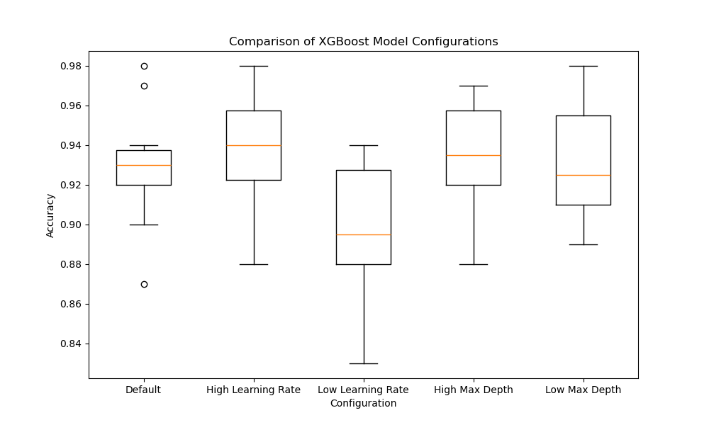
The resulting plot may look as follows:
In this example, we first generate a synthetic binary classification dataset using scikit-learn’s make_classification function. We then define a function called evaluate_model that takes a dictionary of hyperparameters, creates an XGBoost model with those parameters, and evaluates its performance using 10-fold cross-validation.
Next, we define a dictionary called configurations that contains different XGBoost model configurations to compare, such as varying the learning rate and max depth. We evaluate each configuration using the evaluate_model function and store the cross-validation scores in a dictionary called results.
To visualize the results, we create a box and whisker plot using matplotlib. Each box in the plot represents the distribution of cross-validation scores for a specific configuration. The box extends from the first to the third quartile, with a line inside the box representing the median. The whiskers extend to the minimum and maximum scores, excluding outliers.
By examining the box and whisker plot, we can easily compare the performance of different configurations. A configuration with a higher median and a smaller box indicates better and more consistent performance. In this example, the ‘Low Learning Rate’ and ‘High Max Depth’ configurations seem to perform better than the others.
Finally, we print the median accuracy score for each configuration to provide a numerical summary of the results.
Using box and whisker plots to compare XGBoost model configurations allows us to visually assess the performance and consistency of different hyperparameter settings, enabling us to make informed decisions when tuning our models.