
Visualizing individual decision trees in an XGBoost model provides valuable insights into the model’s decision-making process.
XGBoost’s plot_tree() function allows you to easily visualize a specific tree from the trained model.
The plot_tree() function requires that the graphviz project is installed and that the graphviz Python module is installed. This can be achieved using your preferred package managers, such as homebrew and pip.
For example:
# install graphviz project
brew install graphviz
# install graphviz Python module
pip install graphviz
In this example, we’ll demonstrate how to use plot_tree() with a real-world dataset and interpret the resulting visualization.
from sklearn.datasets import load_iris
from sklearn.model_selection import train_test_split
import xgboost as xgb
import matplotlib.pyplot as plt

# Load the Iris dataset
data = load_iris()
X, y = data.data, data.target

# Split the data into train and test sets
X_train, X_test, y_train, y_test = train_test_split(X, y, test_size=0.2, random_state=42)

# Create DMatrix objects
dtrain = xgb.DMatrix(X_train, label=y_train)
dtest = xgb.DMatrix(X_test, label=y_test)

# Set XGBoost parameters
params = {
    'objective': 'multi:softmax',
    'num_class': 3,
    'max_depth': 3,
    'learning_rate': 0.1,
    'subsample': 0.8,
    'colsample_bytree': 0.8,
}

# Train the XGBoost model
model = xgb.train(params, dtrain, num_boost_round=50, evals=[(dtest, 'test')])

# Plot a specific tree from the model
tree_index = 0
xgb.plot_tree(model, num_trees=tree_index)
plt.show()
The plotted tree may look as follows:
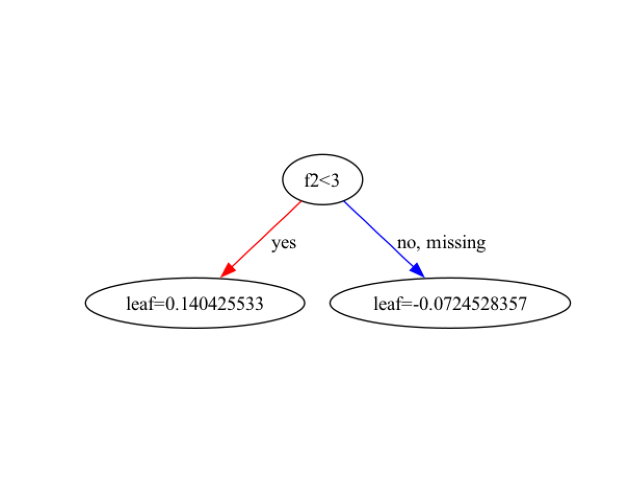
In this example, we load the Iris dataset using scikit-learn’s load_iris() function. We split the data into train and test sets and create DMatrix objects for XGBoost. We set the XGBoost parameters for a multi-class classification problem and train the model using xgb.train().
To visualize a specific tree from the trained model, we use the plot_tree() function. By default, plot_tree() plots the first tree (index 0). You can specify a different tree by setting the num_trees parameter to the desired tree index.
The resulting plot displays the structure of the selected decision tree. Each node represents a feature and a split point, while each leaf node represents a predicted class or value. The color of the nodes indicates the majority class at that node, and the intensity of the color represents the purity of the node.
You can customize the plot by passing additional arguments to plot_tree(). For example, you can change the orientation of the tree by setting rankdir='LR' for left-to-right orientation or rankdir='TB' for top-to-bottom orientation:
xgb.plot_tree(model, num_trees=tree_index, rankdir='LR')
plt.show()
Interpreting the decision tree visualization can provide insights into how the model makes predictions. By examining the split points and the paths from the root to the leaves, you can understand which features are most important for the model’s decision-making process.
Visualizing decision trees using plot_tree() is particularly useful when working with small to medium-sized trees. For larger trees or complex models, the visualization may become cluttered and difficult to interpret. In such cases, it’s recommended to use other interpretability techniques like feature importance plots or SHAP values to gain insights into the model’s behavior.