
When evaluating the performance of a classification model, it’s important to consider not only the overall accuracy but also the types of errors the model is making.
The confusion matrix is a useful tool that provides a tabular summary of the model’s predictions versus the actual class labels, giving insights into false positives and false negatives.
A confusion matrix is a square matrix where each row represents the instances in an actual class, and each column represents the instances in a predicted class. The diagonal elements represent the correctly classified instances, while the off-diagonal elements represent the misclassified instances.
First, we must install the seaborn library so we can visualize the confusion matrix. This can be achieved using our preferred package manager, such as pip:
pip install seaborn
Here’s an example of how to calculate and visualize a confusion matrix for an XGBoost classifier using the scikit-learn library in Python:
from sklearn.datasets import make_classification
from sklearn.model_selection import train_test_split
from xgboost import XGBClassifier
from sklearn.metrics import confusion_matrix
import seaborn as sns
import matplotlib.pyplot as plt

# Generate a synthetic dataset for binary classification
X, y = make_classification(n_samples=1000, n_classes=2, random_state=42)

# Split the data into training and testing sets
X_train, X_test, y_train, y_test = train_test_split(X, y, test_size=0.2, random_state=42)

# Initialize and train the XGBoost classifier
model = XGBClassifier(random_state=42)
model.fit(X_train, y_train)

# Make predictions on the test set
y_pred = model.predict(X_test)

# Calculate the confusion matrix
cm = confusion_matrix(y_test, y_pred)

# Print the confusion matrix
print("Confusion Matrix:")
print(cm)

# Visualize the confusion matrix using seaborn
sns.heatmap(cm, annot=True, fmt='d', cmap='Blues')
plt.xlabel('Predicted Labels')
plt.ylabel('True Labels')
plt.title('Confusion Matrix')
plt.show()
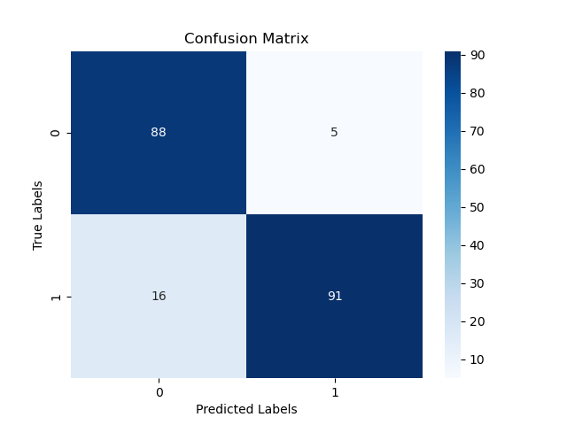
The generated plot may look like the following
In this example:
- We generate a synthetic dataset for a binary classification problem using
make_classificationfrom scikit-learn. - We split the data into training and testing sets using
train_test_split. - We initialize an XGBoost classifier and train it on the training data using
fit(). - We make predictions on the test set using the trained model’s
predict()method. - We calculate the confusion matrix using scikit-learn’s
confusion_matrixfunction, which takes the true labels (y_test) and predicted labels (y_pred) as arguments. - We print the confusion matrix to see the tabular summary of the model’s predictions.
- We visualize the confusion matrix using seaborn’s
heatmapfunction, which creates a color-coded matrix plot with annotations for each cell.
By calculating and visualizing the confusion matrix, we can gain valuable insights into the model’s performance, including the number of true positives, true negatives, false positives, and false negatives. This information can help identify areas where the model is struggling and guide further improvements or model selection decisions.