
Evaluating the performance of a classification model is essential to understand how well it can distinguish between different classes.
One widely used metric for assessing the performance of a binary classifier is the Receiver Operating Characteristic (ROC) curve.
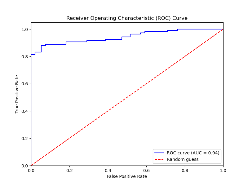
The ROC curve is a graphical representation of a classifier’s performance, plotting the true positive rate (TPR) against the false positive rate (FPR) at various classification thresholds. The TPR, also known as sensitivity or recall, is the proportion of actual positive instances that are correctly identified. The FPR is the proportion of actual negative instances that are incorrectly classified as positive.
Here’s an example of how to plot the ROC curve for an XGBoost classifier using Python:
from sklearn.datasets import make_classification
from sklearn.model_selection import train_test_split
from xgboost import XGBClassifier
from sklearn.metrics import roc_curve, auc
import matplotlib.pyplot as plt

# Generate a synthetic dataset for binary classification
X, y = make_classification(n_samples=1000, n_classes=2, random_state=42)

# Split the data into training and testing sets
X_train, X_test, y_train, y_test = train_test_split(X, y, test_size=0.2, random_state=42)

# Initialize and train the XGBoost classifier
model = XGBClassifier(random_state=42)
model.fit(X_train, y_train)

# Make predictions on the test set
y_pred_proba = model.predict_proba(X_test)[:, 1]

# Calculate the false positive rate, true positive rate, and thresholds
fpr, tpr, thresholds = roc_curve(y_test, y_pred_proba)

# Calculate the area under the ROC curve (AUC)
roc_auc = auc(fpr, tpr)

# Plot the ROC curve
plt.figure(figsize=(8, 6))
plt.plot(fpr, tpr, color='blue', label=f'ROC curve (AUC = {roc_auc:.2f})')
plt.plot([0, 1], [0, 1], color='red', linestyle='--', label='Random guess')
plt.xlim([0.0, 1.0])
plt.ylim([0.0, 1.05])
plt.xlabel('False Positive Rate')
plt.ylabel('True Positive Rate')
plt.title('Receiver Operating Characteristic (ROC) Curve')
plt.legend(loc="lower right")
plt.show()
The generated plot may look like the following
In this example:
- We generate a synthetic dataset for a binary classification problem and split it into training and testing sets.
- We initialize an XGBoost classifier and train it on the training data.
- We make probability predictions on the test set using the trained model’s
predict_proba()method. - We calculate the false positive rate, true positive rate, and thresholds using scikit-learn’s
roc_curvefunction. - We compute the area under the ROC curve (AUC) using scikit-learn’s
aucfunction. - We plot the ROC curve using matplotlib, including labels and a diagonal reference line representing random guessing.
To interpret the ROC curve:
- A curve closer to the top-left corner indicates better classification performance.
- A diagonal line represents a classifier that performs no better than random guessing.
- The area under the curve (AUC) quantifies the model’s ability to distinguish between classes. An AUC of 1 represents a perfect classifier, while an AUC of 0.5 indicates a classifier that performs no better than random guessing.
ROC curves are particularly useful for comparing the performance of different models or selecting an appropriate decision threshold based on the desired balance between true positive rate and false positive rate.
By visualizing the ROC curve, we can assess the XGBoost model’s ability to discriminate between classes and make informed decisions about its performance and potential improvements.