
When evaluating the performance of a classification model, the Precision-Recall (PR) curve is a valuable tool that provides insights into the tradeoff between precision and recall at different classification thresholds. This is particularly useful for imbalanced datasets, where the classes are not equally represented.
Precision measures the proportion of true positive predictions among all positive predictions, while recall measures the proportion of true positive predictions among all actual positive instances. A high area under the PR curve indicates that the model achieves both high precision and high recall.
Here’s an example of how to plot the Precision-Recall curve for an XGBoost classifier using scikit-learn and matplotlib in Python:
from sklearn.datasets import make_classification
from sklearn.model_selection import train_test_split
from xgboost import XGBClassifier
from sklearn.metrics import precision_recall_curve, auc
import matplotlib.pyplot as plt

# Generate a synthetic imbalanced classification dataset
X, y = make_classification(n_samples=1000, n_classes=2, weights=[0.9, 0.1], random_state=42)

# Split the data into training and testing sets
X_train, X_test, y_train, y_test = train_test_split(X, y, test_size=0.2, random_state=42)

# Train an XGBoost classifier
model = XGBClassifier(random_state=42)
model.fit(X_train, y_train)

# Make predictions on the test set
y_pred = model.predict_proba(X_test)[:, 1]

# Calculate precision, recall, and thresholds
precision, recall, thresholds = precision_recall_curve(y_test, y_pred)

# Calculate the area under the PR curve
auc_score = auc(recall, precision)

# Plot the Precision-Recall curve
plt.figure(figsize=(8, 6))
plt.plot(recall, precision, marker='.', label='PR Curve')
plt.xlabel('Recall')
plt.ylabel('Precision')
plt.title(f'Precision-Recall Curve (AUC = {auc_score:.2f})')
plt.legend()
plt.show()
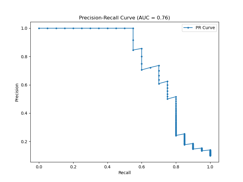
The generated plot may look like the following
In this example:
- We generate a synthetic imbalanced classification dataset using
make_classificationfrom scikit-learn, with a 90:10 class ratio. - We split the data into training and testing sets using
train_test_split. - We train an XGBoost classifier on the training data using
fit(). - We make predictions on the test set using the trained model’s
predict_proba()method, taking the probabilities for the positive class. - We calculate precision, recall, and thresholds using scikit-learn’s
precision_recall_curvefunction. - We calculate the area under the PR curve using the
aucfunction. - Finally, we plot the Precision-Recall curve using matplotlib, with precision on the y-axis and recall on the x-axis, and display the AUC score in the plot title.
By visualizing the Precision-Recall curve, we can assess the performance of the XGBoost classifier across different thresholds and make informed decisions about the optimal tradeoff between precision and recall for our specific problem.