
Quantile regression allows you to estimate prediction intervals by modeling the conditional quantiles of the target variable.
XGBoost supports quantile regression through the "reg:quantileerror" objective.
This example demonstrates how to use XGBoost to estimate prediction intervals and evaluate their quality using the pinball loss.
from sklearn.datasets import make_regression
from sklearn.model_selection import train_test_split
from xgboost import XGBRegressor
from sklearn.metrics import mean_pinball_loss
import numpy as np
import matplotlib.pyplot as plt

# Generate a synthetic dataset for regression
X, y = make_regression(n_samples=1000, n_features=10, noise=0.1, random_state=42)

# Split the data into training and testing sets
X_train, X_test, y_train, y_test = train_test_split(X, y, test_size=0.2, random_state=42)

# Define the quantiles for the prediction intervals
quantiles = [0.1, 0.5, 0.9]

# Train an XGBRegressor for each quantile
models = {}
for quantile in quantiles:
    model = XGBRegressor(objective="reg:quantileerror", quantile_alpha=quantile, n_estimators=100, learning_rate=0.1)
    model.fit(X_train, y_train)
    models[quantile] = model

# Make predictions on the test set for each quantile
predictions = {}
for quantile in quantiles:
    predictions[quantile] = models[quantile].predict(X_test)

# Calculate the pinball loss for each quantile
for quantile in quantiles:
    quantile_loss = mean_pinball_loss(y_test, predictions[quantile], alpha=quantile)
    print(f"Pinball Loss at {quantile} quantile: {quantile_loss:.4f}")

# Visualize the predicted intervals and true values
plt.figure(figsize=(10, 6))
plt.scatter(range(len(y_test)), y_test, color="blue", label="True Values")
plt.scatter(range(len(predictions[0.5])), predictions[0.5], color="red", label="Mean Values")
plt.fill_between(range(len(y_test)), predictions[0.1], predictions[0.9], color="red", alpha=0.2, label="80% Prediction Interval")
plt.xlabel("Sample Index")
plt.ylabel("Target Value")
plt.title("Prediction Intervals with XGBoost Quantile Regression")
plt.legend()
plt.show()
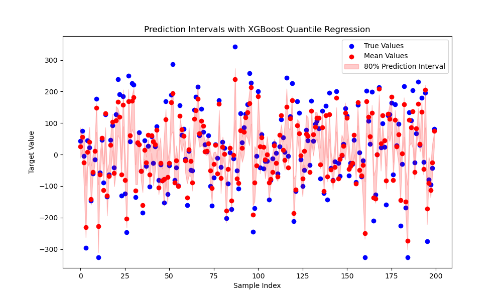
The plot may look like the following:
This example starts by generating a synthetic dataset using scikit-learn’s make_regression function. The data is then split into training and testing sets.
Next, we define the quantiles for the prediction intervals (0.1 and 0.9 for an 80% prediction interval), 0.5 for the mean value, and train an XGBRegressor for each quantile using the "reg:quantileerror" objective. The quantile_alpha parameter is set to the corresponding quantile.
After training, we make predictions on the test set for each quantile and calculate the pinball loss to assess the quality of each model. The pinball loss is a proper scoring rule for quantile regression and measures the accuracy of the predicted quantiles.
Finally, we visualize the predicted intervals along with the true values using matplotlib. The true values are plotted as blue dots, mean values are predicted as red dots, and the 80% prediction interval is shown as a red shaded area.
By using XGBoost’s quantile regression, you can estimate prediction intervals that provide a range of likely values for the target variable, which can be valuable for decision-making and risk assessment in various applications.