
Learning curves are a powerful diagnostic tool for understanding the performance of a machine learning model.
By plotting the model’s performance on the training and validation sets as a function of the training set size, you can gain insights into whether the model is overfitting, underfitting, or well-balanced. This is particularly useful when working with complex models like XGBoost, where the risk of overfitting is higher due to the model’s ability to capture intricate patterns in the data.
To create learning curves for an XGBoost model, you can use the learning_curve function from scikit-learn. Here’s how:
import numpy as np
from sklearn.model_selection import learning_curve
from xgboost import XGBClassifier
from sklearn.datasets import make_classification
import matplotlib.pyplot as plt

# Generate synthetic binary classification dataset
X, y = make_classification(n_samples=10000, n_classes=2, random_state=42)

# Define XGBoost model
xgb_clf = XGBClassifier(n_estimators=10, random_state=42)

# Calculate learning curves
train_sizes, train_scores, test_scores = learning_curve(
    estimator=xgb_clf, X=X, y=y, cv=5, scoring='accuracy',
    train_sizes=np.linspace(0.1, 1.0, 10))

# Calculate mean and standard deviation of scores
train_mean = np.mean(train_scores, axis=1)
train_std = np.std(train_scores, axis=1)
test_mean = np.mean(test_scores, axis=1)
test_std = np.std(test_scores, axis=1)

# Plot learning curves
plt.figure(figsize=(8, 6))
plt.plot(train_sizes, train_mean, color='blue', marker='o', label='Training accuracy')
plt.fill_between(train_sizes, train_mean + train_std, train_mean - train_std, alpha=0.15, color='blue')
plt.plot(train_sizes, test_mean, color='green', marker='+', label='Validation accuracy')
plt.fill_between(train_sizes, test_mean + test_std, test_mean - test_std, alpha=0.15, color='green')
plt.title('Learning Curves')
plt.xlabel('Training set size')
plt.ylabel('Accuracy')
plt.grid()
plt.legend(loc='lower right')
plt.show()
The generated plot may look like the following:
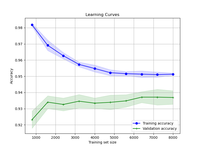
Here’s a step-by-step breakdown:
First, we generate a synthetic binary classification dataset using scikit-learn’s
make_classificationfunction. This is just for illustration purposes; in practice, you would use your actual training data.We define our XGBoost classifier (
XGBClassifier) with a fixed random state for reproducibility.We then use the
learning_curvefunction to calculate the training and validation scores for different training set sizes. We specify the model, the dataset (Xandy), the number of cross-validation splits (cv=5), the performance metric (scoring='accuracy'), and the range of training set sizes to evaluate (train_sizes=np.linspace(0.1, 1.0, 10)).The
learning_curvefunction returns the training set sizes, the training scores, and the validation scores. We calculate the mean and standard deviation of these scores across the cross-validation splits.Finally, we plot the learning curves. The training accuracy is shown in blue, and the validation accuracy is shown in green. The shaded areas represent the standard deviation around the mean scores.
By analyzing the learning curves, you can diagnose potential issues with your model:
- If the training and validation scores converge to a low value, the model is likely underfitting. This suggests that the model is too simple to capture the underlying patterns in the data.
- If the training score is much higher than the validation score, and the gap persists even with larger training set sizes, the model is likely overfitting. This indicates that the model is memorizing the noise in the training data and fails to generalize well to unseen data.
- If the training and validation scores converge to a high value with a small gap, the model is well-balanced. This is the ideal scenario, where the model has learned the relevant patterns in the data without overfitting.
By visualizing the learning curves of your XGBoost model, you can make informed decisions about hyperparameter tuning, model selection, and whether you need to collect more data or apply regularization techniques to mitigate overfitting. This simple yet powerful technique should be a part of every data scientist’s toolkit when working with XGBoost or any other machine learning algorithm.